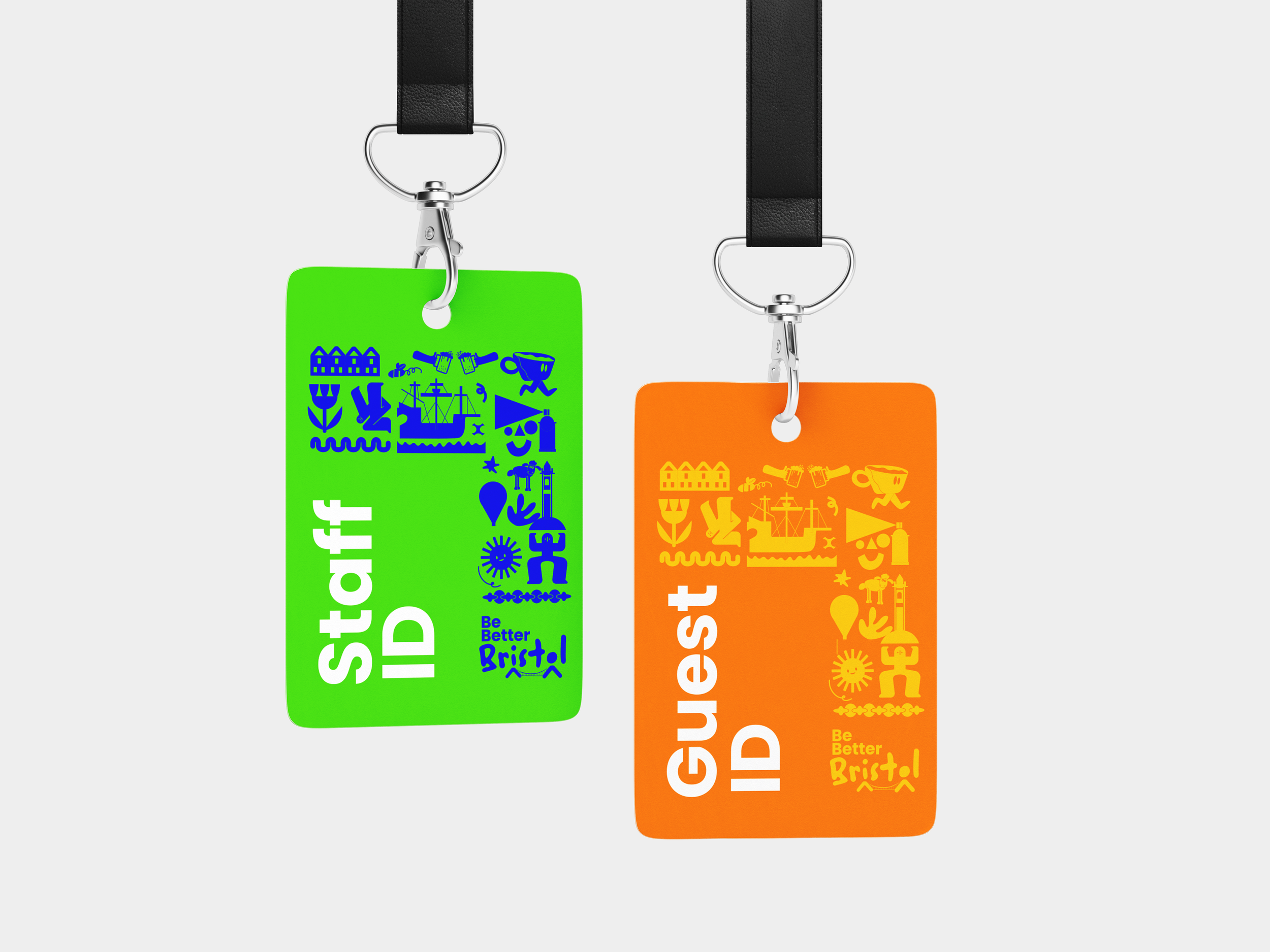
Be Better Bristol
Our Bristol team sought a memorable logo for their annual Be Better Bristol event, aiming for a design that felt unique, fun, and connected to the spirit of the Bristol team. The final design is a wordmark featuring the iconic Clifton Suspension Bridge integrated beneath the text, subtly inspired by the Tour de France logo’s dynamic aesthetic.
For the Be Better Bristol logo, I started with our primary typeface, Poppins, and adapted it to better resonate with Bristol’s vibrant street art and creative culture. By introducing a more organic style, the logo connects with the city’s artistic community. The bridge pillars beneath the “i” and “o” were shaped to resemble figures, symbolizing unity and collaboration—capturing the event’s spirit of bringing people together.


